skip to main |
skip to sidebar
When you place and trace an image in illustrator, often this image will come with a background color, usually white. This is even the case, when you have gone to the trouble to select and delete the background in photoshop. The reason for this is that your photoshop file is set to have a background vs being set for transparency.
When this is the case you can go back and attempt to set the .psd file with a transparent background or you can remove it in illustrator. Here is how you remove it in illustrator:
Convert your Bitmap file to a Vector graphic, using Live Trace
(see the tutorial- Changing your Bitmap Image to a Vector Graphic)
Select the Background:
Using the Select Tool in the Top of the Tool, press down the Shift Key and select all the background ground closed paths (there may be more than one) Once the are all selteted hit delete.
Rasterize you Image
If you prefer to have the image back to its bitmap state, convert the graphic back to a Raster Image by selecting the image and choose Effect/Rastorize.
This assignment is similar to the "AnythingGoes" Photoshop Assignment, in that you will be utilizing all the tools you have learned so far in illustrator to create an interesting, dynamic graphic image. It will also be an opportunity for you to further develop your point of view as it relates to your subject. The assignment requires that you do a little research too, in this way you will see what other people are saying about you topic. Your research should be guided by the perspective that has been developing while you have been visually exploring your topic.
Part 1 Research your topic on the web.
- Using the advanced google search, look for articles that seem to be of interest to you. Read through a couple of websites and pick an article(s) that you feel gives you new insights and builds on your interest in your subject.
- Post on your blog a description (in your words) of the article(s) you read, name the new insights you learned from reading this article(s).
- Include in your post links to the article(s), along with the title and author.
Part 2 Live Trace an Image (For help with Live Trace refer to the post:
"Changing a Bitmap Image to a Vector Graphic"
- Choose an image either of your own or an image off the web that relates to your topic. (remember in either case it must be a large file.
- Place this image in an illustrator file (remember to uncheck the link box.)
- Live Trace the image. You have the option of tracing it in any way you want, there are a lots of options to choose from. Look on the right of the Live Trace Button in the Control Panel. (Photo high/low fidelity will give you a trace most accurate to a photograph-though difficult to edit.)
- Once you have placed the image then Expand and Ungroup it, in order to edit the image.
- From here you can now use Live Paint to change the look of the image, as well as other tools you have practiced and learned in illustrator.
Part 3 Create a collage of your work. You collage should reflect something about your point of view that you are researching.
- Use the "Live Traced" image, and the edits you have made to it, the background for your collage.
- Go ahead and Place your logos and your sketched images in new layers. You will use these new layers to create a collage with your Live Traced/Live Paint image. This is the place to be really creative with opacity, transparency tools, gradients and so on:
- Use the opacity tool to create contrast,
- Use the affects to dramatize parts of your image.
- Rotate and skew parts to give a sense of motion.
- Create multiples and repeat parts to create a feeling of rhythm.
- Play with the intensity of colors to create a mood.
- Use text...etc...
DUE Next Week
Post to Your Blog: (Remember to format for the web!!!)
- A description of the article you read. (Include the link for the article.)
- A post of the original image you Live Traced (Include a link if this is not your image.)
- A post of the Live Traced version of the Original Image.
- DUE at the end of Class: A post of the collaged image you created in Illustrator, this will be used as the basis for you cover page for your final project.
POST to Server at THE END OF CLASS1 pdf file with pages showing your four logos, our traced gradient illustraton and you collage.
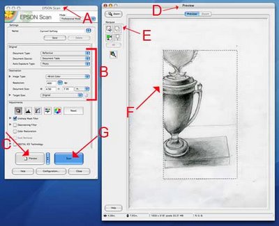
1. Open the Epson Scanner Application
- in the library, just click on the scanner icon in the dock
- in room 37 of the computer lab, open a finder window and go to "Applications", then EpsonScanner.app or in Photoshop go to File/Automate or Import/Epson Perfection
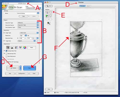
2. The Epson Scan window will open [FIGURE A] (the preview window may open to, just leave it).
3. Check your Settings [FIGURE B]: use the drop down menus to make your selections as follows:
Document type: Reflective (this is for your monitor screen)
Document Source: Document table
Auto Exposure Type: Photo
Image Type: 48-bit or 24-bit color
Resolution: Select your resolution anywhere at minimum 150 to 400 DPI (dots per inch) The more dots per inch, the larger the file size. If you need to use email to transfer the file, you will want to choose a smaller file size BUT you can do this later using the Save for Web function .
4. The remaining adjustments can be left untouched. (these options are available in photoshop)
5. Place your document on the scanner bed and close the lid.
6. Click the "Preview" button [FIGURE C]
7. The "Preview" window will open [FIGURE D] and the scanner will take a quick image of the document and display it here. If you need to reposition the document, do so now and hit "Preview" again.
8. Use the marquee tool [FIGURE E] to draw a selection [FIGURE F] around the portion of the document you want to scan. (This is similar to the crop tool in Photoshop) Everything inside the box will be scanned, everything outside of the box will not be scanned. You can adjust your selection by clicking and dragging the edge of the selection.
9. The Scan Button will become highlighted and then Click the "Scan" button [FIGURE G] to complete the scan.
10. A dialogue box will open asking you where you would like to save your scans and in what format. Navigate to your temporary folder created in the documents folder) Save your document as a JPEG (aka .JPG)
The pen tool is one of the more difficult tools to master in illustrator, however it allows greater amount of possibilities to manipulate your path than you have without it. Below are some simple strokes to practice making. You can also refer to the adobe illustrator CS3 video tutoral workshop -see Illustrator/using the pen tool.
 The goal of this assignment is for you to be able practice using the pen tool, the add and subtract anchor point tools along with the gradient tool and the color picker. You will begin by scanning an image into the computer. This image will be one of your subject or something that relates to your subject. It also need to have been drawn by yourself. You will then trace the scanned image, my making "closed path" basic shapes" using the pen tool. Once traced you will spend some time filling in the illustration, giving it the illusion of three dimension through the use of, value, gradation and scale.Mandi's Blog
1) Draw a sketch of your subject.
2) Scan your image using the Epson printer in the computer labs. See the post for getting help with Scanning Your Image. (Remember to save it as High Resolution (300-400dpi, TIFF)
3) Place the image in Illustrator.
go to File/Place to place an image
with the place window open remember to have the linked box unchecked.
4) In the layer that contains the sketch open up the top right layers folder and click template. This will lower the opacity of the image and will lock this layer.
5) In a new layer, trace your sketch using the pen tool 0r with the pencil tool/smooth tool. IMPORTANT: When tracing: you want to create closed paths. The easiest way to do this is to create a tracing that is made up of all shapes.
6) Once you have completed your tracing, Select the whole tracing (apple A) and copy it into a a new layer. Fill it in using the color picker and the gradient tool. Remember all your shapes must be closed paths, If you forgot to make closed paths you can always go back and use the join tool-see handout.
Due next week:
Post to your blog:
- the original sketch, scanned and saved for the web
- your tracing of the sketch (this will be a black and white illustration)
- your tracing of the sketch-filled in with color and gradations.
- and a colorful description of your final completed assignment.
Upload to Server
- the original sketch, scanned saved as a tiff
- the illustrator file which will include 3 individual layers :
- 1) the placed original image.
- 2) the tracing of the sketch,
- 3) the tracing of the sketch filled in with color picker and gradations.
Vector Graphics and Vector Shapes are made of vectors. They are mathematical objects that make up vector graphics.
Attributes:
Resolution-independent
Easily modified without losing clarity
Editing
Shapes and Paths are edited.
Limitations:
Lose subtle gradations of value and color
Vector Formats:
SVG and SWF-High quality image files with a low resolution.
They can be used for the web.
Raster or Bitmap Images are made up of pixels- a rectangular grid of picture elements.
Attributes:
Resolution-dependent, Able to represent subtle shades of value and color.
Editing
Individual pixels are edited
Limitations
Large amounts of file space. (May need to be compressed)
Raster Formats: GIF, JPEG, PNG, TIFF...etc

1) Open Illustrator (A window will automatically open, allowing you to choose what type of document to work with . CHOOSE A PRINT DOCUMENT) or close this window and open up a new file from the Menu Bar:File/New. Either way the document set up window will open. (see above)
a. Type a document name
b. Choose the size
c. Choose the orientation
d. Choose dimension units: use inches
d. Choose the color mode (always work in rgb. This is the mode the monitor uses.) To change the color mode MenuBar: File/Document Colormode
e. Click OK, (you can edit your document settings again once it is open by going to File/Document Setup.)

2) Open the commonly used Palletes in the Menu Bar: Window/...
f. Choose the Layers
g. The Navigator
h. The Stroke and The Swatches
3) Create Guides and Rulers for your Document
a. Make your ruler visible- Menu Bar: View/ShowRuler. Adjust the corner of your artboard to zero: click and hold the mouse at the left hand corner of the ruler and drag down to the left hand corner of the artboard.
b. Create your Guides: click and hold the mouse on the ruler and drag down the cursor a ¼ inch on each side and in the middle. (this will create a border to account for the print rolers
c. You can place other guides to custom fit the design of your document. Where you put the guides will all depend on what you using them for.
d. To move your guides go to MenuBar: View/Guides/LockGuides (uncheck this)
When choosing fonts for your text, you may not be able to find a font you want in illustrator. You can try finding it online. There is a lot of great fonts to choose from. DA fonts allows you to download a variety of fonts from their site.
When you download the fonts, it will be saved in the hardrive's font folder and will automatically save the fonts in the AdobeSuite programs. In some cases Adobe will not recognize that you downloaded the font and you may need to copy and paste the new font into the Adobe font folder yourself.
To Appropriate: "to take without permission or consent; to sieze or capture."Plagiarize: to steal and pass off (the ideas or words of another) as one's own : use (a created production) without crediting the source.
When using images, other than your own to create artwork, you should be attempting to locate the line where an image or design that was originally created by someone else, ceases to be theirs and becomes yours. To accomplish this, think about how you can insert your own ideas, changes, critiques into the image.
How much of a remnant of the original artist remains before you can claim authorship?
How little of your mark needs to be inserted to make the work your own?
As artists and designers we appropriate images and ideas all the time. The idea of a "true original" in many respects does not exist. Every creation is in some way influenced and inspired by other creations. Yet when can we call those images our own?
.jpg)
Here are some opinion's and critiques on appropriation, concerning the work of Shepard Fairey:
Authorship&Appropriation. "The act of appropriating an image to sell something will always be different than the act of appropriating an image to say something." Matt
Terry Gross's report on Shephard Fiarey's poster of President Obama "Inspiration or Infringement"
"What initially disturbed me about the art of Shepard Fairey is that it displays none of the line, modeling and other idiosyncrasies that reveal an artist’s unique personal style." Critique by Mark Vallen
OBEY Shepard Fairey or else you...
Once you have formated (image size and resolution), edited and manipulated your image in photoshop, you are now ready to make the final adjustments for printing your photo. With a few simple, but important adjustments you can produce satisfying prints that match or come close to what appears on your screen.
Here are the steps to take for PS-CS3:

1) Go to File/Print
- (notice that you are skipping the "page set up" option.)
Here the "Print" window will open. (See above) The print window is divided into three sections:
- "page layout viewing" section.
- "layout adjustment" section.
- "color management" section.
2) In "page layout viewing" section position your paper by either choosing landscape or portrait.
3) In the "layout adjustment" section, choose your printer, the # of copies you want to print and position the image on the page: either by checking center or entering the inches from the top and the left.
DO NOT USE THE SCALE OPTION: You ideally want to adjust your size in photoshop before you print. Also notice that the "Match Print Colors" is not available. This will become available later when you color manage your photo.
4) In this same section now click the "Page Set Up" window. (See Below) In this window, choose your paper size and make sure you are printing to the correct printer then click OK.

5) Now back at the "Print" window over at the "Color Management " section choose color management, document and under color handling choose "Photoshop Manages Colors." A message will appear that asks you if you have disabled color management. You haven't yet but you will later.
6) Now it is time to Pick your Paper. In the "Color Rendering" box choose the type of paper you will be using. And under that choose the rendering type. Either "Relative Color Metric" or "Perceptual" Also check "Black Point Compensation"
Once you have completed this, notice that the "Match Print Colors" in the "layout adjustment" section is now checked. This acts as a way to soft proof your image in the "Print" window. If you uncheck it you will see the difference (if any) between your photo and what will be printed. If there is a large difference between your photo and you print output, you can go back to the image and add Adjustment Layers, without changing the original image. NOW CLICK THE PRINT BUTTON.
7) With this second print window open, look for where it says "Copies and Pages". (See Below) Under this window box, click the arrow in the blue box to the right and scroll down to Print Settings.
 8) With the Print Settings open (See Below) Click Advanced and Unclick HighSpeed.
 9) Now scroll down from "Print Setting" to "Color Management" (See Below) With Color Management open Choose "OFF (No Color Adjustment)" This is telling the computer that you do not want the printer adjusting your colors. This is what you have already done yourself in PS!
 10) OK now you can print your beautiful photograph! Turn on the Printer and Position Your Paper and Click Print.
 This last Photoshop assignment is more open ended than the first two. The main point of this assignment is to combine the skills you have learned so far to create a complex collage of images that is dramatically different from the originals. Your images you use can now include images other than your own. Remember the final image should relate somehow to your subject and most importantly your particular interest in that subject, not only visually but also conceptually.
Before beginning this assignment please review the post on Appropriating Images
some Tools you should be using are:
- The Selection Tools
- Layers to construct your work.
- Copying and Pasting Multiple Images. (or simply click and drag)
- Free transform tool.
- The Edit/Fill Tool
- Adjusting the Color and Value of the Images-from the menu bar: Image/Adjustments
- Adjustment Layers
AND one or two other tools you discovered in Photoshop Help: either the section on
- "Retouching and Transforming"
- "Painting"
- "Drawing"
The Assignment:
- Begin by thinking about your subject and ask yourself: What idea or theme would I like to express? Consider the image above. Jo's was working with the topic of "The Culture of Trash" and wanted to show a worst case scenario world. This project lends itself well to this idea. Photoshop allows you to dream up the fantastic, fictional space for better or worse.
- Once you've thought of your idea, you can now move on to collecting images. You can use images you have taken and images that you have found on the web. Remember to use only large images from the web and also don't forget to cite the sources of all your images.
- Take your images and drag them into 1 Photoshop file and have fun cutting, pasting and using the new tools you learned on your own!
Due next week:
Post to your blog:
- The original images formated for the web, that were used to create your new image. This should include atleast one image that you have appropriated from the internet.
- A description of the images and a link to the website you culled the appropriated image from. Remember to give credit to the artist (if known).
- An image (formated for the web) of your finished assignment.
- A description of your assignment: how it creates a story about your subject and the new tools you used to create the image.
Upload to Server
- The original images, saved as tiff's.
- The finished collage, saved as a tiff or a .psd-with layers.




.jpg)