When choosing fonts for your text, you may not be able to find a font you want in illustrator. You can try finding it online. There is a lot of great fonts to choose from. DA fonts allows you to download a variety of fonts from their site.
When you download the fonts, it will be saved in the hardrive's font folder and will automatically save the fonts in the AdobeSuite programs. In some cases Adobe will not recognize that you downloaded the font and you may need to copy and paste the new font into the Adobe font folder yourself.
Wednesday, October 07, 2009

DIGITAL TOOLS ASSIGNMENT 5, Logos with Images & Text!

Part 1
Image on left by RosesRoom
For this assignment you will be getting familiar with the basic shapes tools in illustrator by creating simple logo icons and logo text for the subject you have been up till now photographing.
1) Remember to review the class blog tutorial on Setting up an Illustrator Document
2) Review the Online Video Tutorials in Illustrator:
- "Saving files for the Web."
- "Creating type on a path."
- "Using the line, eraser and shape tool."
- "Selecting and Manipulating Objects."
Then go ahead and review the Drawing Tools, they will be helpful when working with basic shapes.
3) And don't forget using Illustrator Help is another way to get assistance with using the program. for example:
- Expanding symbols: manipulate them can be found in: Help/Drawing/Symbols/Work with Symbol Instants/Modify a Symbol Instant (Remember you will need to go to Object/Ungroup to separate out the shapes. Sometimes you have to repeat this several times.)
Part 2: CREATE YOUR OWN LOGO
The method and process for creating images and manipulating them in illustrator can be compared with cutting and pasting color paper to build and image vs photoshop which can be compared with painting which creates an images through subtle gradations.
1) To become familiar with the process of building an image, egin this assignment by creating an image of your subject using the color paper. This will help you understand how creating an image with basic shapes in illustrator works.
- Scan this paper project and post it on your blog. (See the blog post for "Scanning Images")
2) Now open one illustrator document. You will use this one document for all four Logos. Each logo will be created in separate layers .
- a) In the "new document window" choose “letter” for the size of the paper and the "vertical placement".
2) Using the Basic Shape Tools, create four different variations of a "logo picture" that symbolically represent your topic (Your logo should be an abstract design or simplified illustration. It should not be text. (think the nike and the apple logo). You logo image should also relate to the images you have been creating in photoshop.
Here are a few student's logos:
This is Basma's logo.


This is Kelly's Logo
Reminder:
- You can use google image search: type in logos or logo icons for ideas
- IMPORTANT: Each logo should be placed in a separate layer, in your one document.
Part 3: DESIGNING a TEXT Logo with FONT STYLES.
1) Based on the point of view you have been developing around your subject and considering the logos style you have created with your "logo icons", design four titles to go with your logo icon.
This is Angelina's text logo

This is Kaysia's text logo

Reminder:
- Choose 1-2 font styles to work with. If you cannot find a font that will work for you. You can download fonts from DAFonts.
- Remember Expanding and Ungrouping the test will give you more freedom to edit the text.
- You can do a google image search: type in "logos text" for ideas
- Each title should be placed in a separate layers, in your one document with your logos.
Due Next Week:
1) Post your color paper project and all 4 versions of your logo icons and logo titles to your blog.
- a. You will need to save each layer containing each logo as a jpeg or gif using the save for the web option. Do this by making the layer you want visible and all the other layers invisible.
- b. Both the logos and the title should have a description about the concept behind design you chose.
Wednesday, September 30, 2009
APPROPRIATING IMAGES, When to Call it Yours.
To Appropriate: "to take without permission or consent; to sieze or capture."
Plagiarize: to steal and pass off (the ideas or words of another) as one's own : use (a created production) without crediting the source.
When using images, other than your own to create artwork, you should be attempting to locate the line where an image or design that was originally created by someone else, ceases to be theirs and becomes yours. To accomplish this, think about how you can insert your own ideas, changes, critiques into the image.
How much of a remnant of the original artist remains before you can claim authorship?
How little of your mark needs to be inserted to make the work your own?
As artists and designers we appropriate images and ideas all the time. The idea of a "true original" in many respects does not exist. Every creation is in some way influenced and inspired by other creations. Yet when can we call those images our own?
.jpg)
Here are some opinion's and critiques on appropriation, concerning the work of Shepard Fairey:
Authorship&Appropriation. "The act of appropriating an image to sell something will always be different than the act of appropriating an image to say something." Matt
Terry Gross's report on Shephard Fiarey's poster of President Obama "Inspiration or Infringement"
"What initially disturbed me about the art of Shepard Fairey is that it displays none of the line, modeling and other idiosyncrasies that reveal an artist’s unique personal style." Critique by Mark Vallen
OBEY Shepard Fairey or else you...
Plagiarize: to steal and pass off (the ideas or words of another) as one's own : use (a created production) without crediting the source.
When using images, other than your own to create artwork, you should be attempting to locate the line where an image or design that was originally created by someone else, ceases to be theirs and becomes yours. To accomplish this, think about how you can insert your own ideas, changes, critiques into the image.
How much of a remnant of the original artist remains before you can claim authorship?
How little of your mark needs to be inserted to make the work your own?
As artists and designers we appropriate images and ideas all the time. The idea of a "true original" in many respects does not exist. Every creation is in some way influenced and inspired by other creations. Yet when can we call those images our own?
.jpg)
Here are some opinion's and critiques on appropriation, concerning the work of Shepard Fairey:
Authorship&Appropriation. "The act of appropriating an image to sell something will always be different than the act of appropriating an image to say something." Matt
Terry Gross's report on Shephard Fiarey's poster of President Obama "Inspiration or Infringement"
"What initially disturbed me about the art of Shepard Fairey is that it displays none of the line, modeling and other idiosyncrasies that reveal an artist’s unique personal style." Critique by Mark Vallen
OBEY Shepard Fairey or else you...
MANAGING YOUR PRINT OUTPUT IN PHOTOSHOP
Once you have formated (image size and resolution), edited and manipulated your image in photoshop, you are now ready to make the final adjustments for printing your photo. With a few simple, but important adjustments you can produce satisfying prints that match or come close to what appears on your screen.
Here are the steps to take for PS-CS3:

1) Go to File/Print
2) In "page layout viewing" section position your paper by either choosing landscape or portrait.
3) In the "layout adjustment" section, choose your printer, the # of copies you want to print and position the image on the page: either by checking center or entering the inches from the top and the left.
DO NOT USE THE SCALE OPTION: You ideally want to adjust your size in photoshop before you print. Also notice that the "Match Print Colors" is not available. This will become available later when you color manage your photo.
4) In this same section now click the "Page Set Up" window. (See Below) In this window, choose your paper size and make sure you are printing to the correct printer then click OK.

5) Now back at the "Print" window over at the "Color Management " section choose color management, document and under color handling choose "Photoshop Manages Colors." A message will appear that asks you if you have disabled color management. You haven't yet but you will later.
6) Now it is time to Pick your Paper. In the "Color Rendering" box choose the type of paper you will be using. And under that choose the rendering type. Either "Relative Color Metric" or "Perceptual" Also check "Black Point Compensation"
Once you have completed this, notice that the "Match Print Colors" in the "layout adjustment" section is now checked. This acts as a way to soft proof your image in the "Print" window. If you uncheck it you will see the difference (if any) between your photo and what will be printed. If there is a large difference between your photo and you print output, you can go back to the image and add Adjustment Layers, without changing the original image. NOW CLICK THE PRINT BUTTON.
7) With this second print window open, look for where it says "Copies and Pages". (See Below) Under this window box, click the arrow in the blue box to the right and scroll down to Print Settings.
 8) With the Print Settings open (See Below) Click Advanced and Unclick HighSpeed.
 9) Now scroll down from "Print Setting" to "Color Management" (See Below) With Color Management open Choose "OFF (No Color Adjustment)" This is telling the computer that you do not want the printer adjusting your colors. This is what you have already done yourself in PS!
 10) OK now you can print your beautiful photograph! Turn on the Printer and Position Your Paper and Click Print.
Here are the steps to take for PS-CS3:

1) Go to File/Print
- (notice that you are skipping the "page set up" option.)
- "page layout viewing" section.
- "layout adjustment" section.
- "color management" section.
2) In "page layout viewing" section position your paper by either choosing landscape or portrait.
3) In the "layout adjustment" section, choose your printer, the # of copies you want to print and position the image on the page: either by checking center or entering the inches from the top and the left.
DO NOT USE THE SCALE OPTION: You ideally want to adjust your size in photoshop before you print. Also notice that the "Match Print Colors" is not available. This will become available later when you color manage your photo.
4) In this same section now click the "Page Set Up" window. (See Below) In this window, choose your paper size and make sure you are printing to the correct printer then click OK.

5) Now back at the "Print" window over at the "Color Management " section choose color management, document and under color handling choose "Photoshop Manages Colors." A message will appear that asks you if you have disabled color management. You haven't yet but you will later.
6) Now it is time to Pick your Paper. In the "Color Rendering" box choose the type of paper you will be using. And under that choose the rendering type. Either "Relative Color Metric" or "Perceptual" Also check "Black Point Compensation"
Once you have completed this, notice that the "Match Print Colors" in the "layout adjustment" section is now checked. This acts as a way to soft proof your image in the "Print" window. If you uncheck it you will see the difference (if any) between your photo and what will be printed. If there is a large difference between your photo and you print output, you can go back to the image and add Adjustment Layers, without changing the original image. NOW CLICK THE PRINT BUTTON.
7) With this second print window open, look for where it says "Copies and Pages". (See Below) Under this window box, click the arrow in the blue box to the right and scroll down to Print Settings.
 8) With the Print Settings open (See Below) Click Advanced and Unclick HighSpeed.
 9) Now scroll down from "Print Setting" to "Color Management" (See Below) With Color Management open Choose "OFF (No Color Adjustment)" This is telling the computer that you do not want the printer adjusting your colors. This is what you have already done yourself in PS!
 10) OK now you can print your beautiful photograph! Turn on the Printer and Position Your Paper and Click Print.
DIGITAL TOOLS ASSIGNMENT 5, Anything Goes!

This last Photoshop assignment is more open ended than the first two. The main point of this assignment is to combine the skills you have learned so far to create a complex collage of images that is dramatically different from the originals. Your images you use can now include images other than your own. Remember the final image should relate somehow to your subject and most importantly your particular interest in that subject, not only visually but also conceptually.
Before beginning this assignment please review the post on Appropriating Images
some Tools you should be using are:
- The Selection Tools
- Layers to construct your work.
- Copying and Pasting Multiple Images. (or simply click and drag)
- Free transform tool.
- The Edit/Fill Tool
- Adjusting the Color and Value of the Images-from the menu bar: Image/Adjustments
- Adjustment Layers
AND one or two other tools you discovered in Photoshop Help: either the section on
- "Retouching and Transforming"
- "Painting"
- "Drawing"
- Begin by thinking about your subject and ask yourself: What idea or theme would I like to express? Consider the image above. Jo's was working with the topic of "The Culture of Trash" and wanted to show a worst case scenario world. This project lends itself well to this idea. Photoshop allows you to dream up the fantastic, fictional space for better or worse.
- Once you've thought of your idea, you can now move on to collecting images. You can use images you have taken and images that you have found on the web. Remember to use only large images from the web and also don't forget to cite the sources of all your images.
- Take your images and drag them into 1 Photoshop file and have fun cutting, pasting and using the new tools you learned on your own!
Due next week:
Post to your blog:
- The original images formated for the web, that were used to create your new image. This should include atleast one image that you have appropriated from the internet.
- A description of the images and a link to the website you culled the appropriated image from. Remember to give credit to the artist (if known).
- An image (formated for the web) of your finished assignment.
- A description of your assignment: how it creates a story about your subject and the new tools you used to create the image.
- The original images, saved as tiff's.
- The finished collage, saved as a tiff or a .psd-with layers.
Wednesday, September 23, 2009
BASICS COURSE ASSIGNMENT 4 Figure&Ground, Working w/Adjustment Layers


There are three goals for this assignment:
- The first is for you to continue practicing using the selection tools.
- Second is for you to make adjustments to your image using adjustment layers.
- And third is for you to experiment with the basic elements of color: hue, saturation and brightness.
The assignment has two parts:
- Part 1 First asks you to improve and clarify the quality of an image by making selections and adjusting the image using adjustment layers. Then part 1 asks you to dramatically alter the look of an image, again by making selections and adjusting the image using adjustment layers. Part 1 leaves you with two finished images
- Part 2 Asks you to take you perspective image and create four distinct copies of the image. Each image with play with a specific characteristic of color
The completed assignment should also give us some insight into your interest in your topic.
To begin
- Start my visiting the Adobe CS3 Video Workshop site, under the product Photoshop, watch the video for "making and refining selections" and "making tonal corrections" and the Adobe CS4 Video Workshop site under making adjustments. The first shows you how to use the quick selection tool and the refine edge feature. The second is a great example for working with with Adjustment Layers in CS3 and the third updates you on the new and improved adjustment layer panel in CS4.
PART 1
IMPROVING THE QUALITY OF YOUR IMAGE and CHANGE THE ENTIRE LOOK OF YOUR IMAGE
Choose your image from assignment 3- "Changing your background.
- The image should clearly have a Figure and Ground (your subject and the foreground and background) What this means is that there should be an object in your image that is clearly your Subject. It is also helpful if the background is able to be selected into two parts, a shallow ground, called the foreground and a more distant ground called the Background.
- The image should need improving. Do not pick a perfect image. For example choose one where the background might be too dark, or the object is slightly blurred.
- This image should also be of high resolution. No less than 1MB in size.
First improve the image
- With the image opened in Photoshop, Select the object within the image using the appropriate selection tool.
- With the selection on, save and name the selection.
- In your layers palette select the adjustment layer, located at the bottom, middle section of the layers palette. (Remember the object should still be selected and the layer that you want to adjust is highlighted.)
- With the adjustment layer selected, scroll down and choose the adjustment needed to improve upon the quality of your image. (For example your object is too blue, choose the hue and saturation or color adjustment to change the hue.)
- Repeat this step for your foreground and your background.
- Using the same image follow the same steps this time experimenting with tools in the tool bar, change the look of your entire image.
- What this means is that you will use the adjustment layers and image altering tools, not to simply improve on your image, but rather use them to dramatically change the look of your image.
- For example with the adjustment layers you can increase the saturation to give it a psychedelic feel or desaturate the image to create a feeling of nostalgia. With the image altering tools such as the "spot healing brush tool" you can completely remove parts of your image, or with the brush tool you can create a graffiti look to the image or with the "pattern stamp tool" you can create a mozaic affect.
PART 2
CREATE A 4 PANEL COLOR STUDY FROM YOUR PERSPECTIVE IMAGE

Choose your images from assignment 3- "Creating Perspective".
- IN PART Part 2 Take your perspective image and create four distinct copies of the image. Each image with play with a specific characteristic of color
- The first image choose a color and make it monchromatic
- The second choose the colors compliment and create a contrast of hue
- Third play with the saturation, either decreasing or increasing it.
- Fourth play with the brightness, either decreasing or increasing the value.
Due Next Week:
midnight the night before class:
- Format for the web
- your original image
- the improved image for part 1
- the image the dramatacly changed image for part 2.
- 4 panel color image
- Upload them to your blog.
- Write a description about what you changed.
- Explain how the changed image in Part 2 communicates to us something about your topic.
Bring to Class.
- Your original image. (This image should either be a high resolution jpeg, tiff.)
- 2 .psd files from Part 1 and Part 2 (These should include the adjustment layers).
- Remember to name your files so I can easily identify them.
Wednesday, September 16, 2009
COLOR THEORY & MANAGING FOR PRINT
The ABC’s of Color Theory & Color Management
The Primary Colors
- Red
- Green
- Blue
- Cyan
- Yellow
- Magenta
- (K)
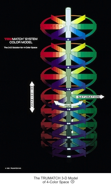
The 3 Dimensions of Color
- Hue-The Color
- Saturation-The Intensity
- Brightness-Value-Light/Dark
A Three Dimensional Color Wheel

the TRUE MATCH COLOR WHEEL
3 Factors in Managing Color:
The Image
The Paper
The Printer
The Image
Adjusting the color quality of the image.
a. Adjust directly:
i. on site with your camera
b. Adjust indirectly:
i. from the menu bar: image/adjustment
ii. or in the layers pallete with an adjustment layer.
The Paper
Change the paper type you are using
Glossy vs Matte…
The Printer
Adjustments to your printer
Clean the heads
Calibrate your printer to the monitor
Change printers
Fill the ink
CS3 “Print” Window
Synchronizes
The image---The paper---The printer
&
Soft Proofs
3 Factors in Managing Color:
1) The image
2) The paper
3) The printer
1) Adjusting the color quality of a printed image.
a. Adjust directly: menu bar: image/adjustment/…
b. Adjust indirectly as an adjustment layer.
2) Change the paper type you are using
a. Glossy vs Matte…
- (A common inkjet printer paper is the Epson Matte-Heavyweight)
3) Adjustments to your printer
a. Clean the heads
- (run a test first)
b. Calibrate your printer to the monitor
- (Custom Color Profiles)
c. Change printers
CS3 PRINT WINDOW
Synchronizes: 1) The image. 2) The paper 3) The printer
Soft Proofing
for more info on Color Management
POSTING LINKS TO BLOG POSTS

1) Highlight the text you want the links to be attached too (FIG A)
2) Tab over to the website on your web browser and Copy and Paste the URL address
into the Link Window (FIG C) and click OK.
3) Click on the link icon
 just above the text window (FIG B)
The highlighted text will show up as hyper-text, if posted correctly.
PHOTOGRAPHIC PAPER for the Epson Printer
The standard photographic paper for the Epson Printer used to be called Enhanced Matte Paper. The name has changed to:
Epson Ultra Premium Presentation Paper Matte (Enhanced).
Check out the Altex website in Florida for good prices and lots of choices.
There is also Staples, if you need paper right away.
Epson Ultra Premium Presentation Paper Matte (Enhanced).
Check out the Altex website in Florida for good prices and lots of choices.
There is also Staples, if you need paper right away.
SAVING ASSIGNMENTS TO THE SERVER V.2
Each time you arrive in class you will need to save your adobe projects onto the server.
(The information on the server is erased every monday, therefore, the server is not a replacement for your dropsend or thumbdrive acc.)
HERE IS HOW YOU DO IT:
1. Go to Finder/Go/Connect to server.
2. Type in: 10.10.10.172
3. Sign is as a guest.
4. Create a folder with your name on it ei: "Lena Helen". Folders are in alphabetical order.
5. Click and drag your finished assignments into the folder before the end of class. (Uploading can only be done on Campus.)

(The information on the server is erased every monday, therefore, the server is not a replacement for your dropsend or thumbdrive acc.)
HERE IS HOW YOU DO IT:
1. Go to Finder/Go/Connect to server.
2. Type in: 10.10.10.172
3. Sign is as a guest.
4. Create a folder with your name on it ei: "Lena Helen". Folders are in alphabetical order.
5. Click and drag your finished assignments into the folder before the end of class. (Uploading can only be done on Campus.)

ONLINE CS3 TUTORIALS
CS3 Suite. has online video tutorals . At any time you can go to this site to re-familiarize yourself with the tools and commands we are covering.


OVERVIEW OF THE LAYERS PALLETE
The layers palette can be found in the Menu Bar under Window/Layers
Like the navigator tool the layers palette is an essential organizing tool for many of the the Creative Suite Programs.
Below is a diagram of the Layers pallet and corresponding labels for the buttons:

FIG. A: The background layer is your original layer when you open an image. You can initially unlock the layer by double clicking and renaming it. This layer is highlighted meaning you can edited the layer once it is renamed
FIG. B: An empty layer is indicated by a grey and white grid, to the left of the layer. You can move a layer by highlighting it: click, hold and drag it over or under another layer
FIG. C: The eye icon indicates that the layer is visible. To make a layer invisible, click the eye and it will disappear. A layer must be visible and highlighted inorder to edit it.
FIG. D: The lock button locks a layer when it is highlighted.
FIG. E: The trash button is for deleting layers. Highlight: click, hold and drag a layer over the trash can to delete it.
FIG. F: The new layers button creates new and empty layers. To make a copy of a layer, highlight the layer and click, hold and drag it over the new layers button.
FIG. G: The group button allows you to make folders. The is good for organizing your layers into groups.
FIG. H: The links button allows you to link layers together. To link layers you must have the layers highlighted: hold down the shift key to highlight more than one layer.
FIG I: The layers menu button show you more options and commands for the layers palette
FIG J: The opacity button allows you to adjust the opacity of a layer.
SETTING BACKGROUND COLOR IN PHOTOSHOP
You have the option of setting the background color on a Photoshop file when you first create a new file.
When you go to FILE/NEW there is an option to set the background content - to white, background color or transparency. In most cases you will want to choose transparency. PS will "remember" this setting for the files opened after that.
Also, if you need to delete a background color, once you have opened a file you can just select it (apple/a) and cut the object out of the layer.
When you go to FILE/NEW there is an option to set the background content - to white, background color or transparency. In most cases you will want to choose transparency. PS will "remember" this setting for the files opened after that.
Also, if you need to delete a background color, once you have opened a file you can just select it (apple/a) and cut the object out of the layer.
Subscribe to:
Posts (Atom)