Vector Graphics and Vector Shapes are made of vectors. They are mathematical objects that make up vector graphics.
Attributes:
Resolution-independent
Easily modified without losing clarity
Editing
Shapes and Paths are edited.
Limitations:
Lose subtle gradations of value and color
Vector Formats:
SVG and SWF-High quality image files with a low resolution.
They can be used for the web.
Raster or Bitmap Images are made up of pixels- a rectangular grid of picture elements.
Attributes:
Resolution-dependent, Able to represent subtle shades of value and color.
Editing
Individual pixels are edited
Limitations
Large amounts of file space. (May need to be compressed)
Raster Formats: GIF, JPEG, PNG, TIFF...etc
Wednesday, October 07, 2009
SETTING UP A DOCUMENT IN ILLUSTRATOR

1) Open Illustrator (A window will automatically open, allowing you to choose what type of document to work with . CHOOSE A PRINT DOCUMENT) or close this window and open up a new file from the Menu Bar:File/New. Either way the document set up window will open. (see above)
a. Type a document name
b. Choose the size
c. Choose the orientation
d. Choose dimension units: use inches
d. Choose the color mode (always work in rgb. This is the mode the monitor uses.) To change the color mode MenuBar: File/Document Colormode
e. Click OK, (you can edit your document settings again once it is open by going to File/Document Setup.)

2) Open the commonly used Palletes in the Menu Bar: Window/...
f. Choose the Layers
g. The Navigator
h. The Stroke and The Swatches
3) Create Guides and Rulers for your Document
a. Make your ruler visible- Menu Bar: View/ShowRuler. Adjust the corner of your artboard to zero: click and hold the mouse at the left hand corner of the ruler and drag down to the left hand corner of the artboard.
b. Create your Guides: click and hold the mouse on the ruler and drag down the cursor a ¼ inch on each side and in the middle. (this will create a border to account for the print rolers
c. You can place other guides to custom fit the design of your document. Where you put the guides will all depend on what you using them for.
d. To move your guides go to MenuBar: View/Guides/LockGuides (uncheck this)
BASIC DRAWING TOOLS FOR ILLUSTRATOR
Below are the tools you will need to get started in Illustrator. These pages are taken from the Illustrator Help Tool Gallery. You can go to Adobe Help to print them.
(To view the images below in a larger format double click the image.)


(To view the images below in a larger format double click the image.)


FREE FONTS TO DOWNLOAD
When choosing fonts for your text, you may not be able to find a font you want in illustrator. You can try finding it online. There is a lot of great fonts to choose from. DA fonts allows you to download a variety of fonts from their site.
When you download the fonts, it will be saved in the hardrive's font folder and will automatically save the fonts in the AdobeSuite programs. In some cases Adobe will not recognize that you downloaded the font and you may need to copy and paste the new font into the Adobe font folder yourself.
When you download the fonts, it will be saved in the hardrive's font folder and will automatically save the fonts in the AdobeSuite programs. In some cases Adobe will not recognize that you downloaded the font and you may need to copy and paste the new font into the Adobe font folder yourself.
DIGITAL TOOLS ASSIGNMENT 5, Logos with Images & Text!

Part 1
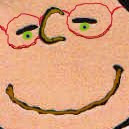
Image on left by RosesRoom
For this assignment you will be getting familiar with the basic shapes tools in illustrator by creating simple logo icons and logo text for the subject you have been up till now photographing.
1) Remember to review the class blog tutorial on Setting up an Illustrator Document
2) Review the Online Video Tutorials in Illustrator:
- "Saving files for the Web."
- "Creating type on a path."
- "Using the line, eraser and shape tool."
- "Selecting and Manipulating Objects."
Then go ahead and review the Drawing Tools, they will be helpful when working with basic shapes.
3) And don't forget using Illustrator Help is another way to get assistance with using the program. for example:
- Expanding symbols: manipulate them can be found in: Help/Drawing/Symbols/Work with Symbol Instants/Modify a Symbol Instant (Remember you will need to go to Object/Ungroup to separate out the shapes. Sometimes you have to repeat this several times.)
Part 2: CREATE YOUR OWN LOGO
The method and process for creating images and manipulating them in illustrator can be compared with cutting and pasting color paper to build and image vs photoshop which can be compared with painting which creates an images through subtle gradations.
1) To become familiar with the process of building an image, egin this assignment by creating an image of your subject using the color paper. This will help you understand how creating an image with basic shapes in illustrator works.
- Scan this paper project and post it on your blog. (See the blog post for "Scanning Images")
2) Now open one illustrator document. You will use this one document for all four Logos. Each logo will be created in separate layers .
- a) In the "new document window" choose “letter” for the size of the paper and the "vertical placement".
2) Using the Basic Shape Tools, create four different variations of a "logo picture" that symbolically represent your topic (Your logo should be an abstract design or simplified illustration. It should not be text. (think the nike and the apple logo). You logo image should also relate to the images you have been creating in photoshop.
Here are a few student's logos:
This is Basma's logo.

This is Kelly's Logo
Reminder:
- You can use google image search: type in logos or logo icons for ideas
- IMPORTANT: Each logo should be placed in a separate layer, in your one document.
Part 3: DESIGNING a TEXT Logo with FONT STYLES.
1) Based on the point of view you have been developing around your subject and considering the logos style you have created with your "logo icons", design four titles to go with your logo icon.
This is Angelina's text logo

This is Kaysia's text logo

Reminder:
- Choose 1-2 font styles to work with. If you cannot find a font that will work for you. You can download fonts from DAFonts.
- Remember Expanding and Ungrouping the test will give you more freedom to edit the text.
- You can do a google image search: type in "logos text" for ideas
- Each title should be placed in a separate layers, in your one document with your logos.
Due Next Week:
1) Post your color paper project and all 4 versions of your logo icons and logo titles to your blog.
- a. You will need to save each layer containing each logo as a jpeg or gif using the save for the web option. Do this by making the layer you want visible and all the other layers invisible.
- b. Both the logos and the title should have a description about the concept behind design you chose.
Subscribe to:
Comments (Atom)